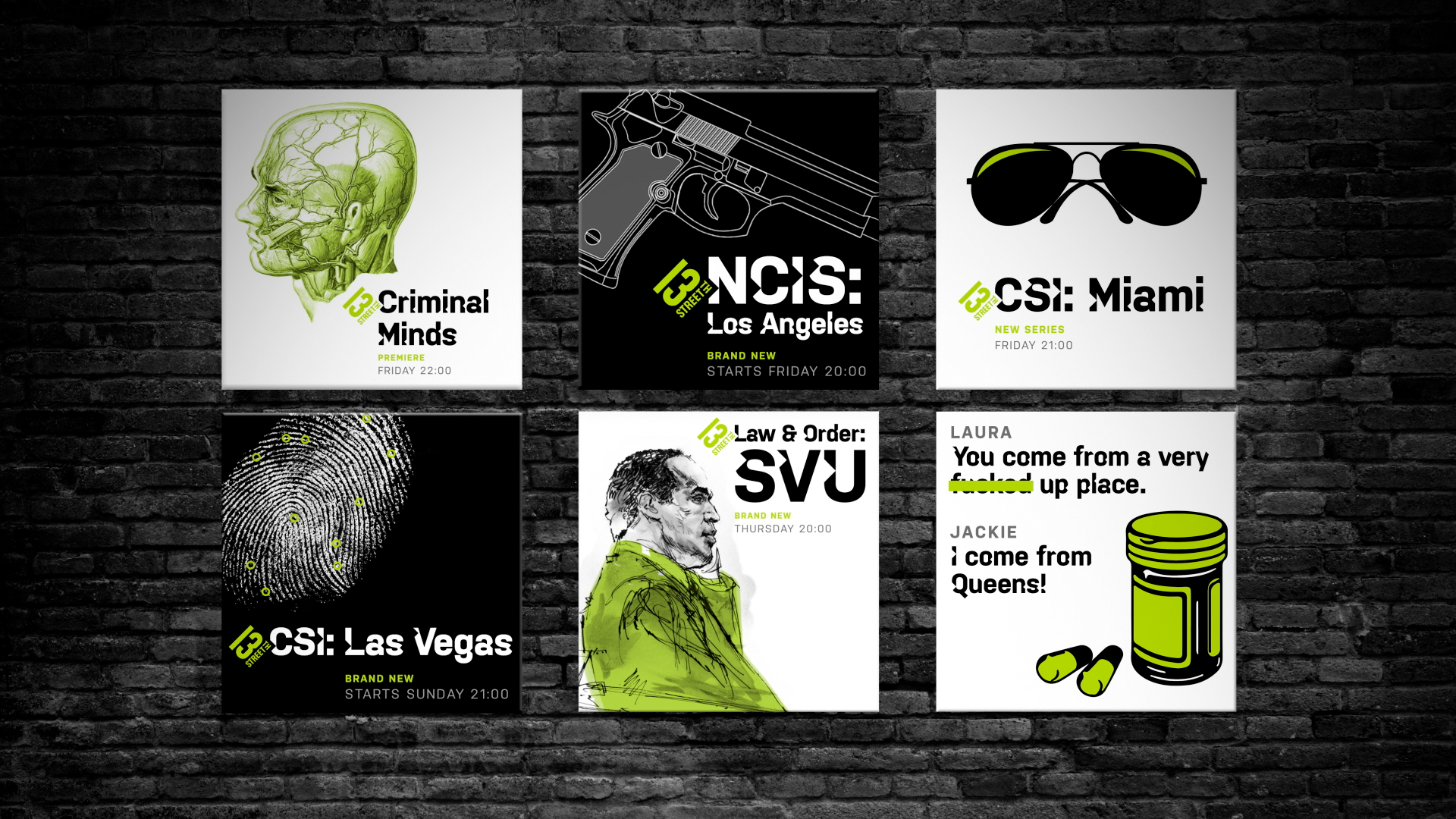
The aim with 13th Street brand refresh was to embrace a thrilling, intriguing and thought-provoking approach to the crime genre across all the brand’s platforms. Specific emphasis was placed upon social media to ensure 13th Street operated as a social-centric brand, and that its unexpected tonality resonated beyond just the linear channel. This enabled the brand to be part of the conversation with crime fans irrespective of their access to the linear channel.
UNEXPECTED, GRIPPING AND FEARLESS
The brand execution aimed at the heartland of the modern crime genre, behaving with an intriguing and edgy tone. Using a range of graphic elements and animations within the visual identity allowed the brand to be versatile and unpredictable across every platform. This style then combined with a minimalist black and white colour palette and the iconic 13th Street green to provide a strong, graphic presence in combination with the channel content.
CRAFTING THE TYPEFACE
A bespoke typeface was crafted specifically for the 13th Street brand. The idea behind the display font of removing 1/13th of each character created a scarred effect. Each letter features a small diamond shape indent inspired by the shape of the 13th Street brand logo.
LOCKING THE LOGO
By crafting a bespoke typeface, it allowed the logo to lock-in to key messaging and typographical elements. This ensured the brand is always partnered with the content and key communication of the brand design.
RESTRICTING THE VIEW
To enhance the detective experience of the brand further, a letterbox device, the focus-in, was created to restrict the view of the audience. This created an additional level of intrigue, leaving viewers to question what existing beyond the frame, what were they missing and how would seeing that help them understand the case?
A QUESTIONING AND
THOUGHT-PROVOKING VOICE
The thrilling nature of programming across 13th Street is enhanced through the tone of voice which operates in a disruptive and questioning way. The brand always aims to leave behind more questions than answers and often leaves the audience to fill in the blanks.
INTRIGUING A SOCIAL AUDIENCE
A key part of the rebrand was to re-invigorate the social community of 13th Street. There was a huge audience engaging with both true crime podcasts and crime fiction online and it was essential that the conversation extended beyond the linear channel. To do this, the suite of brand mechanics transcended onto the social platforms, creating a range of content unique to the social space, therefore adding to the audience’s experience along with the programming.
UNPREDICTABLE IDENTS
As well as graphical design elements, a suite of 50+ idents were created for the brand using a unique, interchangeable narrative approach that could be used both on-air and on social. By creating a versatile library of crime-themed footage all shot in the same cinematic style, it meant idents could be edited and re-edited over and over to tell new stories and pose new questions.
Alongside the creative design was the brilliance of Hans Zimmer and Bleeding Fingers’ soundtrack, providing the distinctive ingredients to deliver a unique brand experience. See the cinematography reel below.
CREDITS:
Chief Marketing Officer: Lee Raftery (NBCUniversal International)
SVP Global Creative: Marco Giusti (NBCUniversal International)
Director of Photography: Adriaan Kirchner (Creative Rebellion)
Shoot Production: Noam Kroll & Gabe Reiter (Creative Rebellion)
Colourist: Oisin O’Driscoll (The Mill)
Music Produced by Hans Zimmer & Bleeding Fingers
Brand Strategy and Concept: Red Bee Creative
Executive Creative Director: Charlie Mawer (Red Bee Creative)
Tracks: Halsey - Castle, Chromatics - Tick of the Clock


