Europa+ is a new streaming service dedicated to bringing premium European TV shows direct to audiences all across Latin America and the Caribbean. It is uniquely placed to offer a specially curated range of European content in its original language. Europa+ sets out to add a splash of European culture to entertainment viewing, from intense Italian culinary masterclasses to award-winning British dramas, and German crime series to relaxing Nordic interior makeovers. Europa+ knows just what to add.
ADD SOME EUROPE
Europa+ sets out to achieve two things as an SVOD platform; offer more diversity of entertainment in Latin America beyond the usual western content, and to provide easy access to European programming. This idea of adding more content for audiences to enjoy is a natural starting point for the brand, and the plus becomes the central brand mechanic to deliver all messaging and elements.
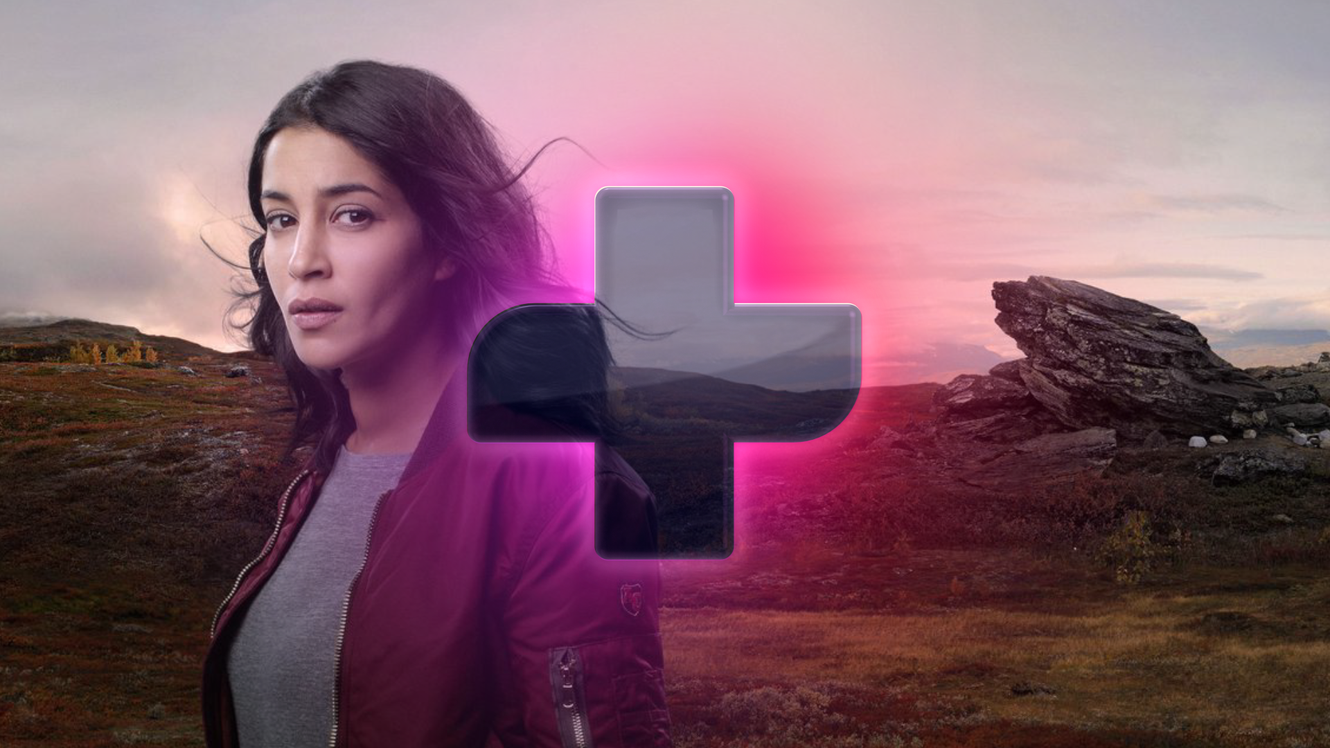
Not only does the plus form an integral part of the brand logo, it also acts as a way to connect content. It joins shows together as an endless combination of entertainment that is forever expanding, it unifies the wide mix of programming genres together and it links the diverse range of TV shows from different countries from across Europe.
A PASSIONATE PALETTE
With such a rich and diverse array of programming available on the Europa+ platform, a vibrant palette helps to compliment the overall European personality. A set of emotionally driven palettes add splashes of colour into every part of the branding, providing different highlights to suit the various moods of the shows. The colour ways are also designed to effectively illuminate both the core background tones of onyx and pearl.
UNVEILING EUROPA+
To reveal Europa+ the brand needed a fanfare, something that would excite and captivate the audience whenever they watched a show on the service. This came in the form of an ident; a short animation demonstrating the wonder, passion and energy of the brand, showing how all the diversity of Europe joins together into one place - the plus.
MÁS MEANS MORE
The brand also needed a clear way to communicate, but with such a mix of European languages across the platform, it needed an approach that could bring a flavour of them all together. To do this, we focussed on the word Más. In Spanish, this means both more, and plus, playing directly into both the brand name and the brand concept. A system was developed that would allow Más to manifest in different European languages across the brand tone of voice; More (English), Mais (Portuguese), Più (Italian), Mehr (German), Plus (French) and many more.
BRINGING EUROPE TO THE USER
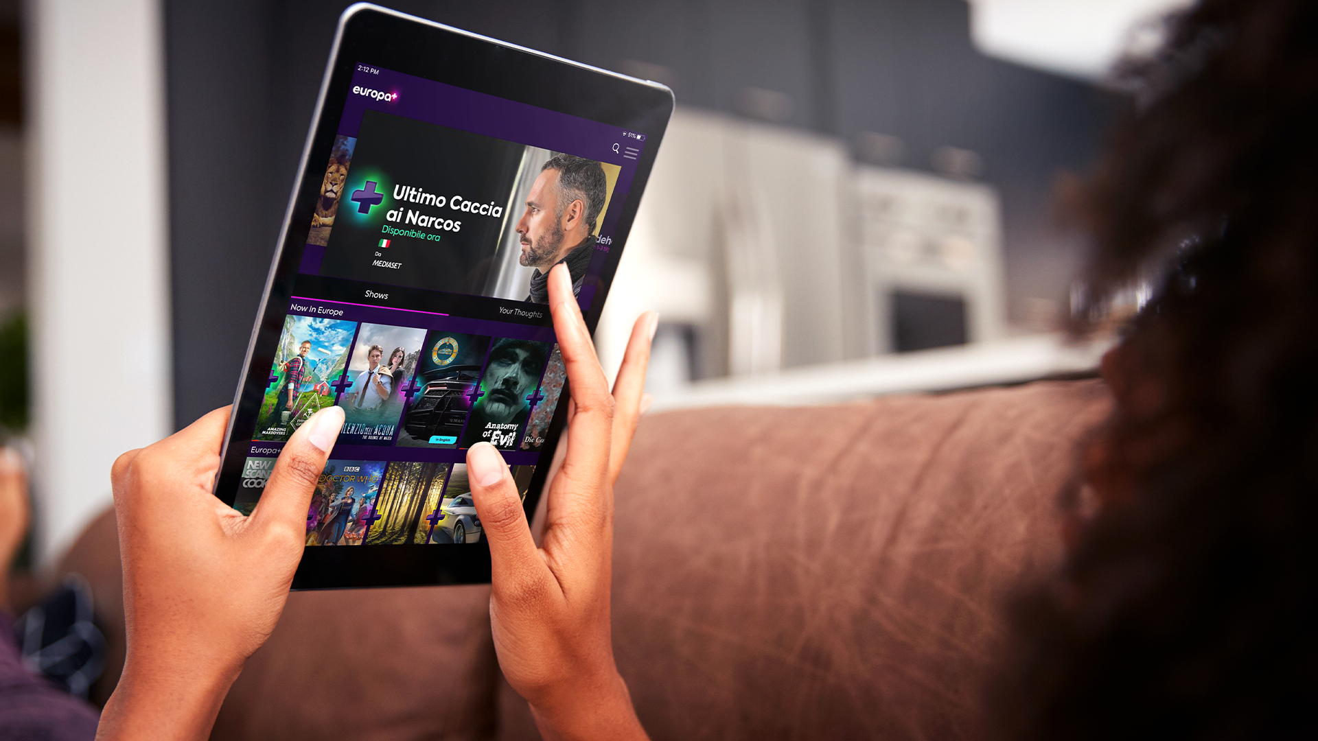
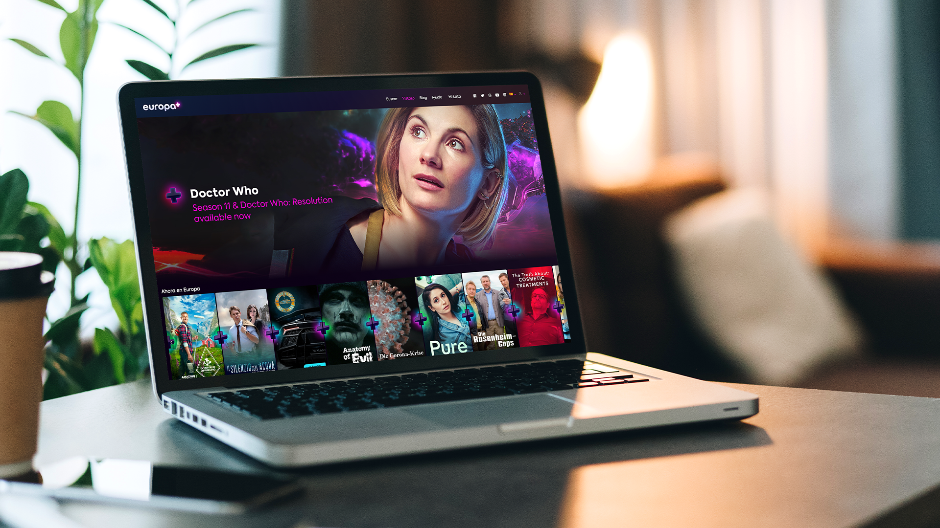
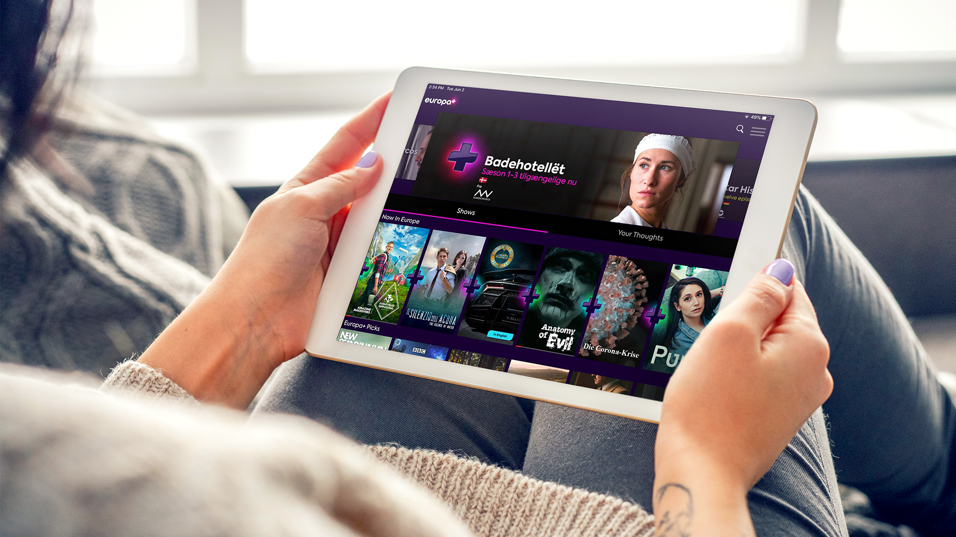
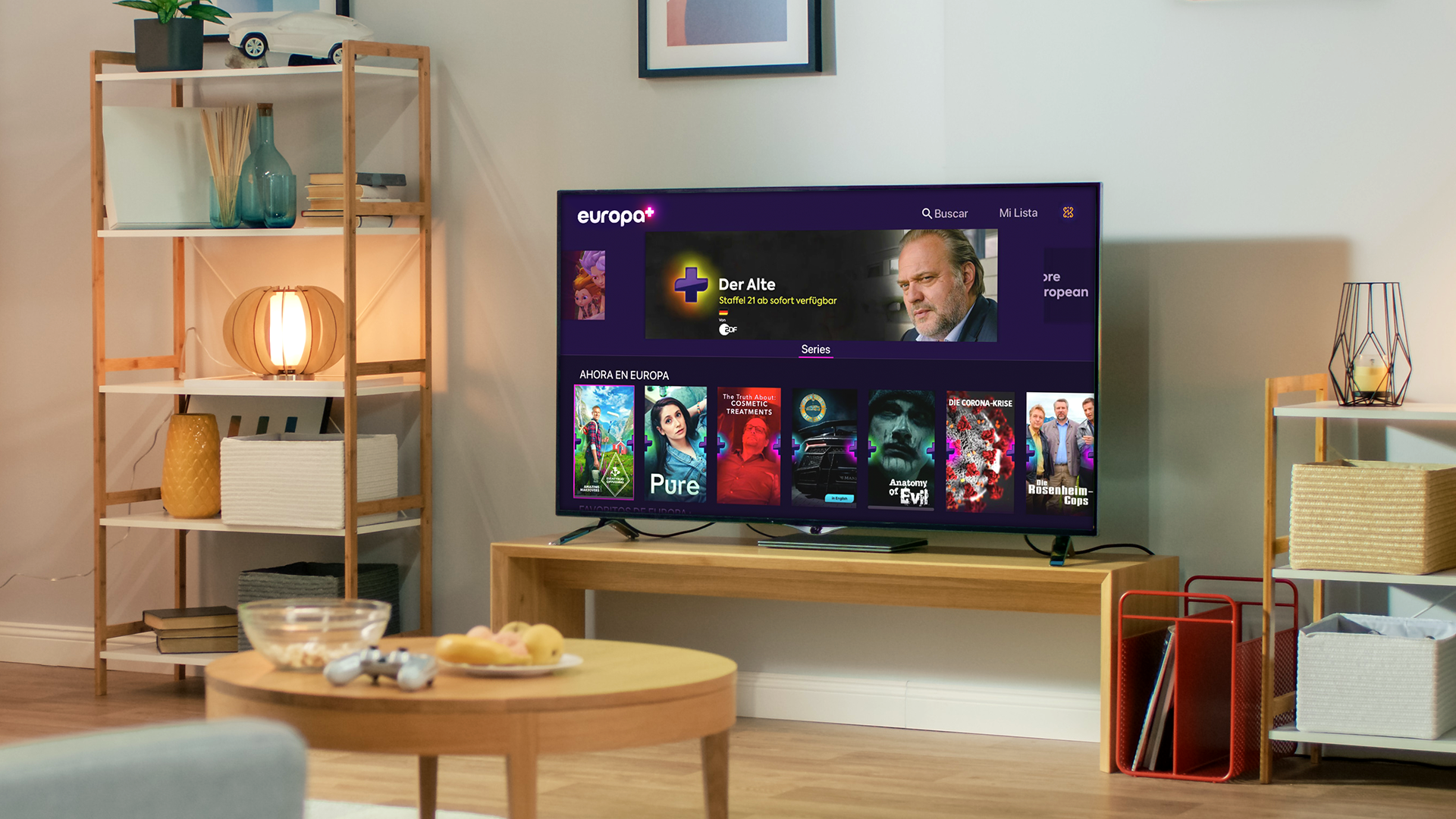
To bring Europa+ to Latin America and the Caribbean, a well engineered app and easy to use website would be vital. Using the brand components already developed, a website was crafted aimed at providing the absolute essential information to the user in the simplest way possible, prompting them into a simple subscription process for the service.
The Europa+ app enabled a flexible viewing experience for users, giving them the chance to access content on-the-go. The interface for the app integrated the brand aesthetic across all elements to make all variations of the platform look and feel consistent.
A PREMIUM PROMO PACKAGE…
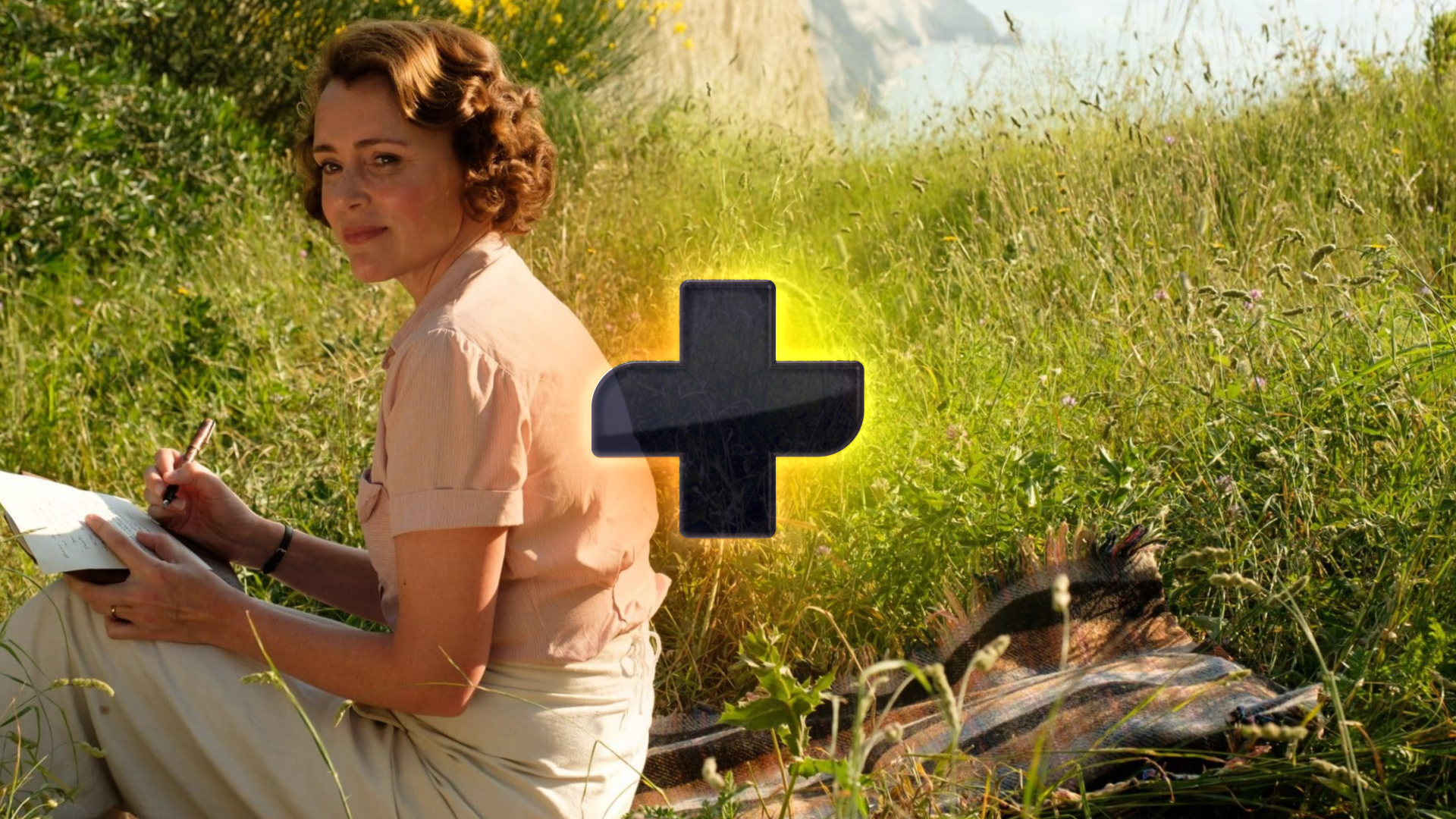
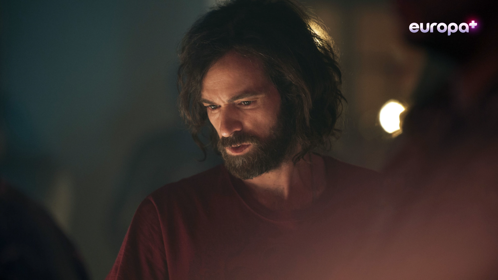
With so much content available on Europa+, it was important to take as much ownership of the shows as possible, ensuring every audience associated the programming with the brand. Part of the branding involved the development of a robust motion toolkit of logo animations, promo openers and endboards and captioning templates.
…AND VERSATILE AD SOLUTIONS
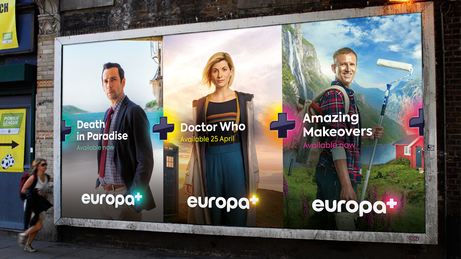
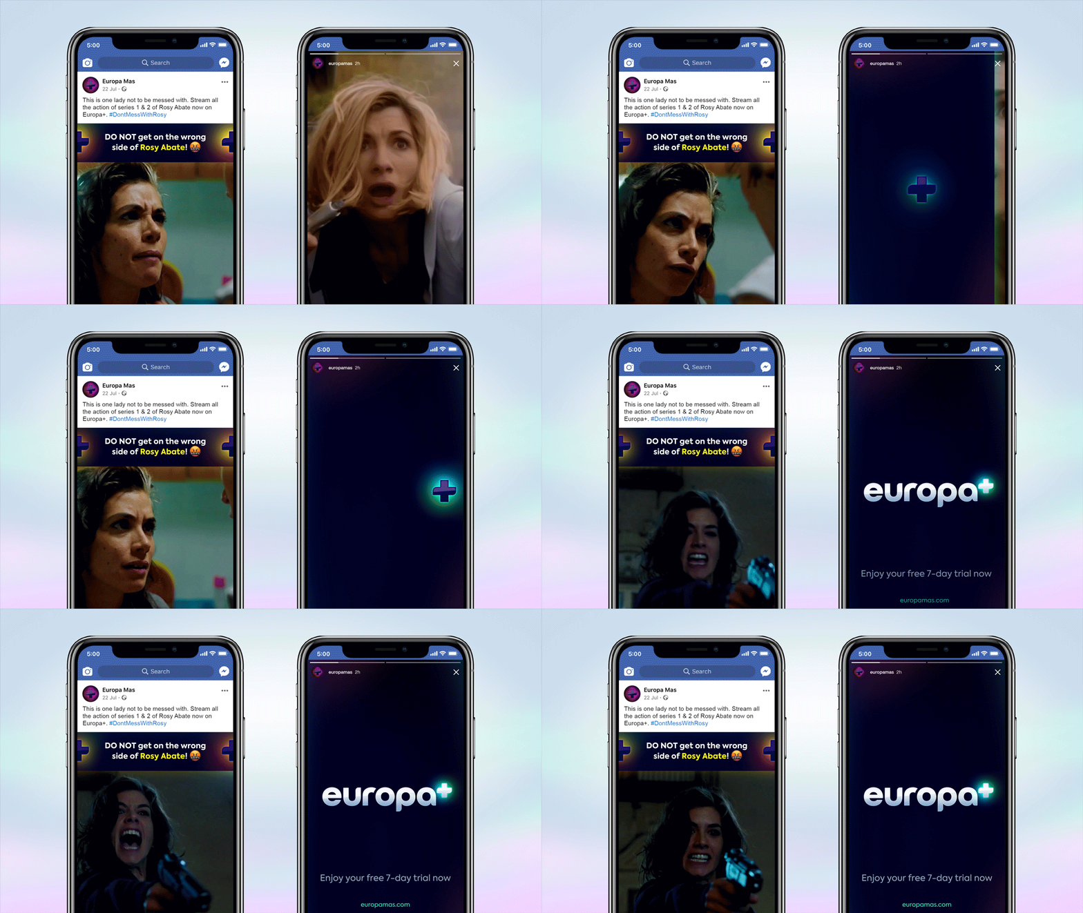
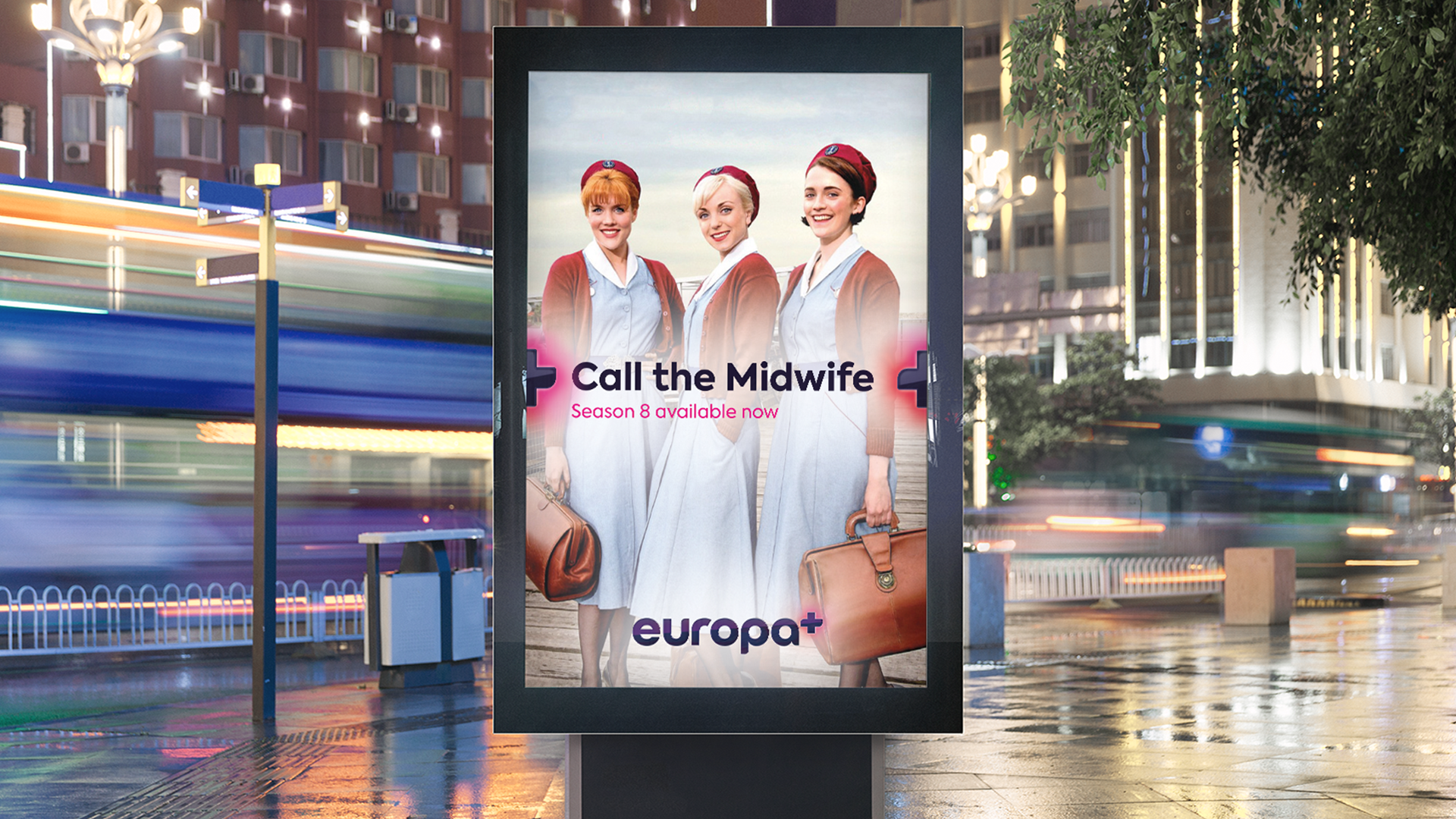
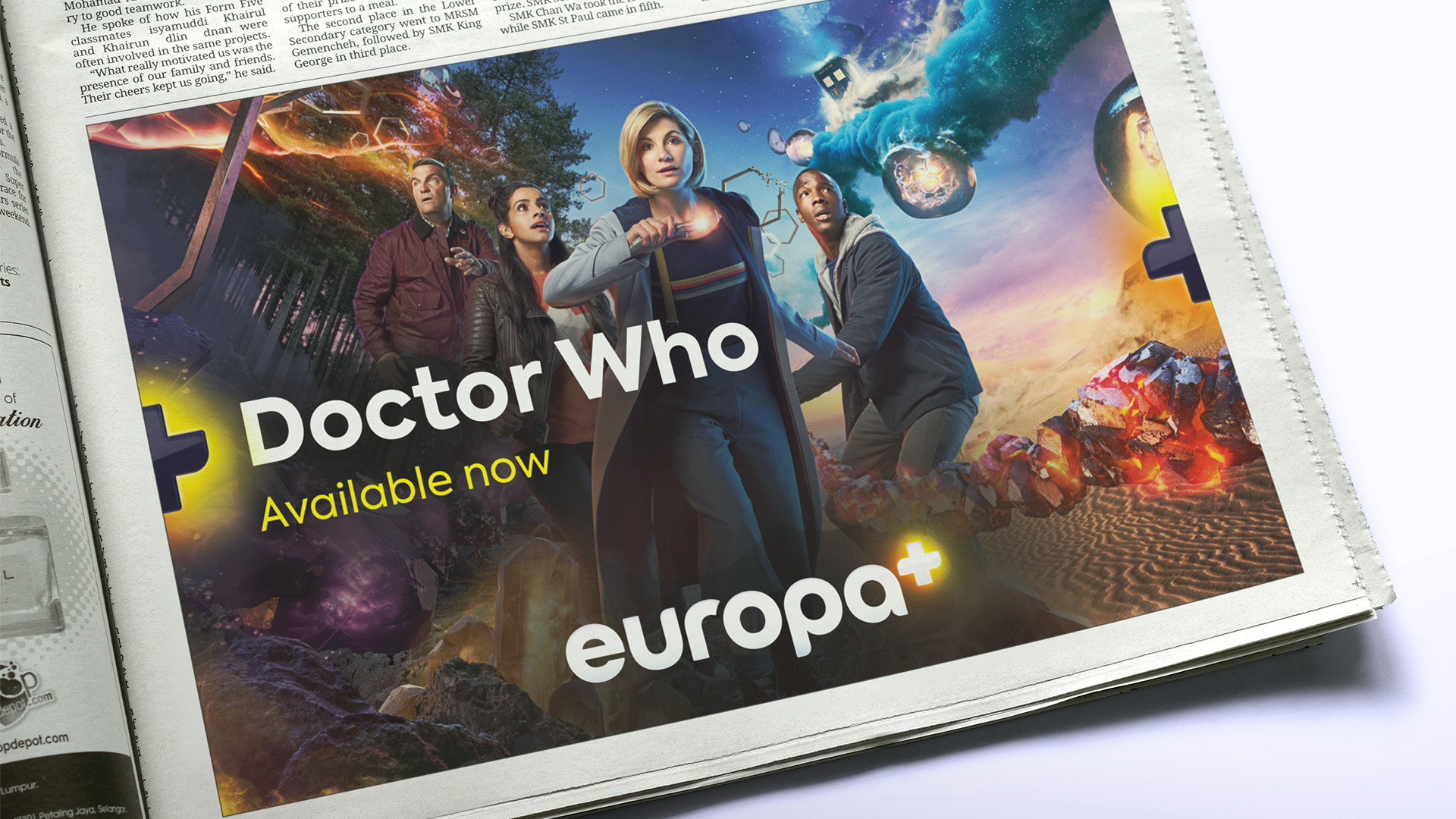
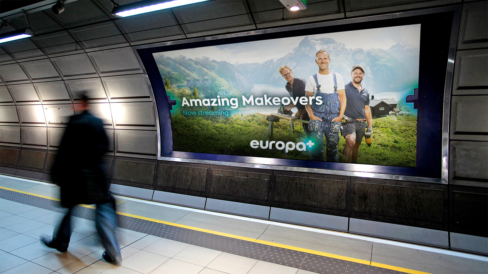
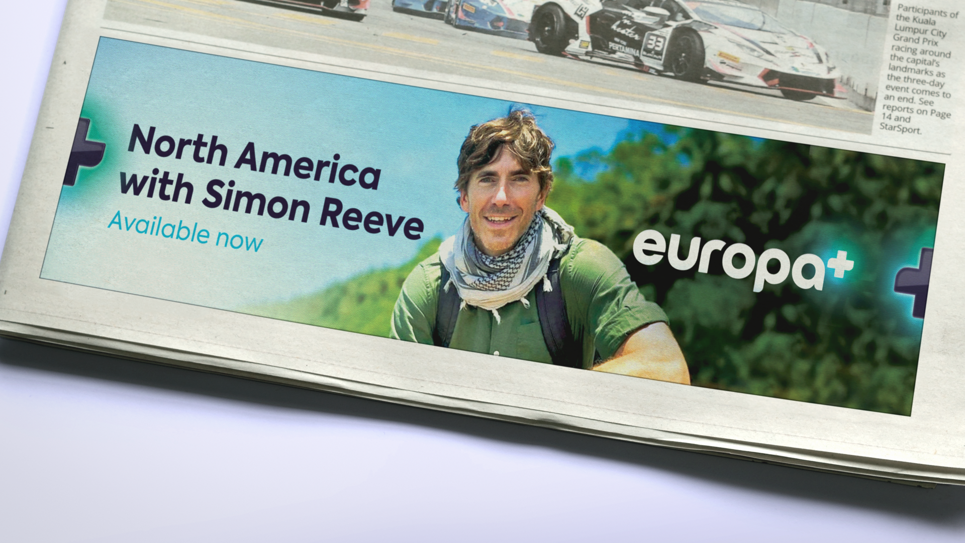
Alongside the motion toolkit, a whole host of principles were carried through onto various different mediums to deliver advertising. This ranged from out-of-home and press advertising through to digital ad designs, social asset creation and digital mailers.
LAUNCHING EUROPA+
To announce the launch of Europa+ across Latin America and the Caribbean, we created a campaign of assets to build brand awareness across multiple touchpoints. Leading with a slick brand reel celebrating the vast array and diversity of content on offer, there were also countdown teasers to build anticipation as well as short, sharp teasers to drive subscriptions across both paid and organic media.
COLLABORATORS:
Ident VFX: Julian Martin-Samos
Ident Audio: Zelig Studio
Logo Animations: Studio Ultra
