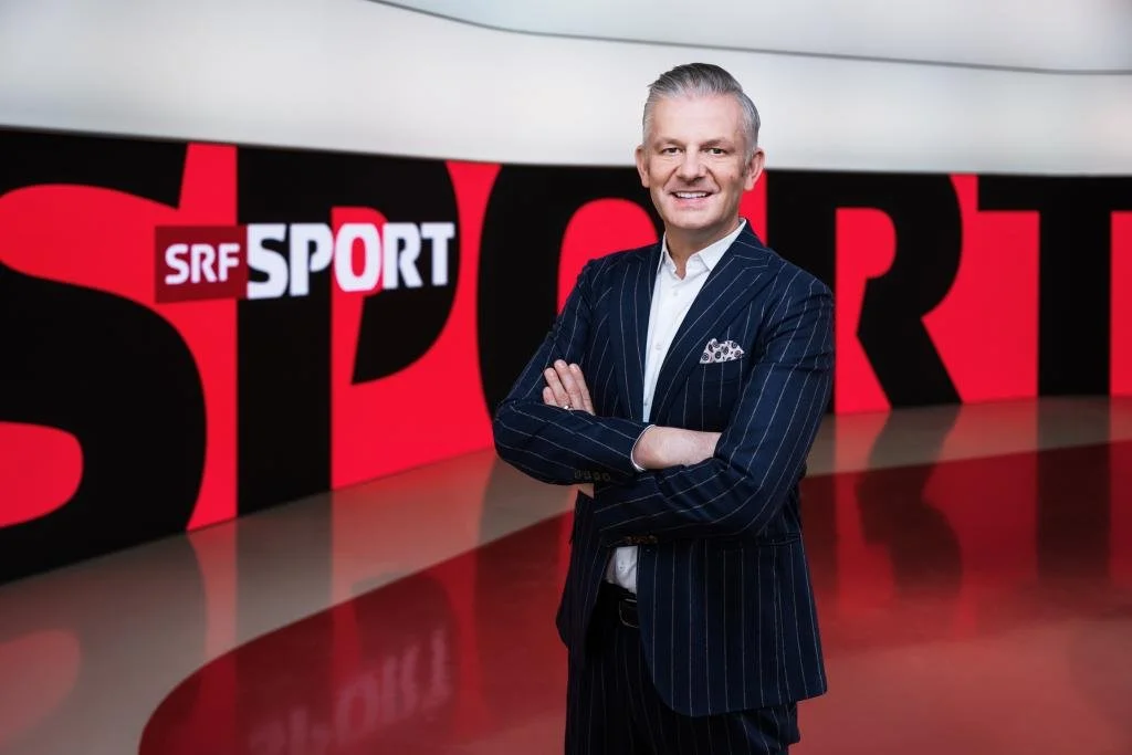
SRF Sport is the Swiss heart of sport. It's a home for athletes and teams that are celebrated by fans across the whole country. The biggest sporting events on both Swiss and international stages are shown here, and the most exciting and emotional moments in the sporting world are shared and experienced.
BRINGING FANS CLOSER TO SPORT
The creative thought at the core of SRF Sport is to bring audiences closer to the sports they love. We put Swiss fans in the game at the centre of the action and let them experience every emotion of sport. The concept of feeling closer is reflected in every element of the brand, from the logo and font to key visuals and the on-air package.
BLACK, WHITE AND SWISS ALL OVER
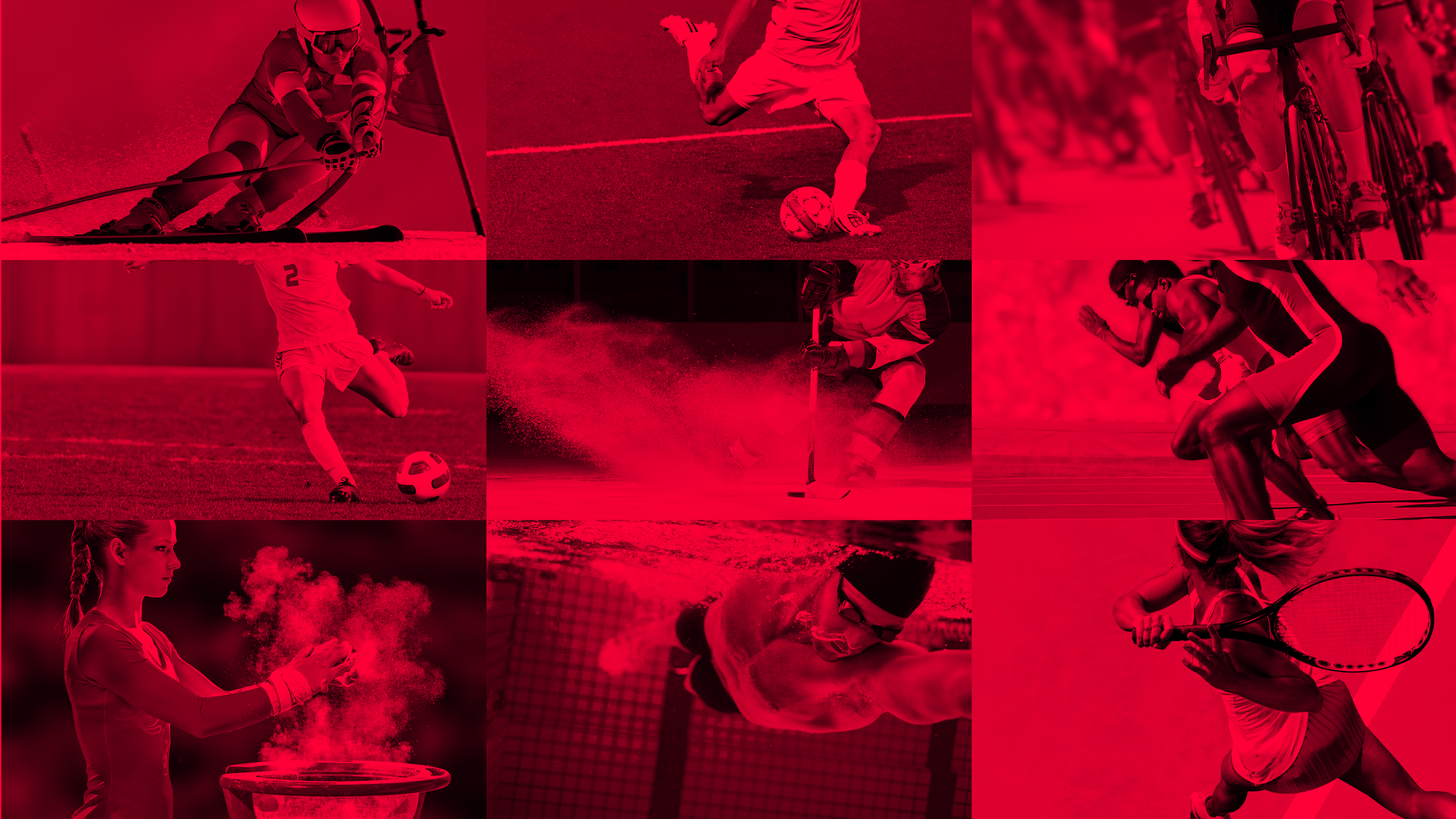
The colour palette is inherently Swiss, taking the iconic red and white of the national flag and flooding it through every asset to take a distinct ownership of SRF Sport elements. This is heavily contrasted with black to create a crisp palette allowing for the use of heavy black and white grading throughout the brand imagery.
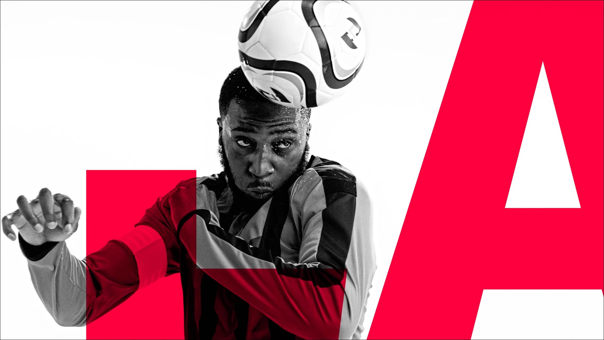
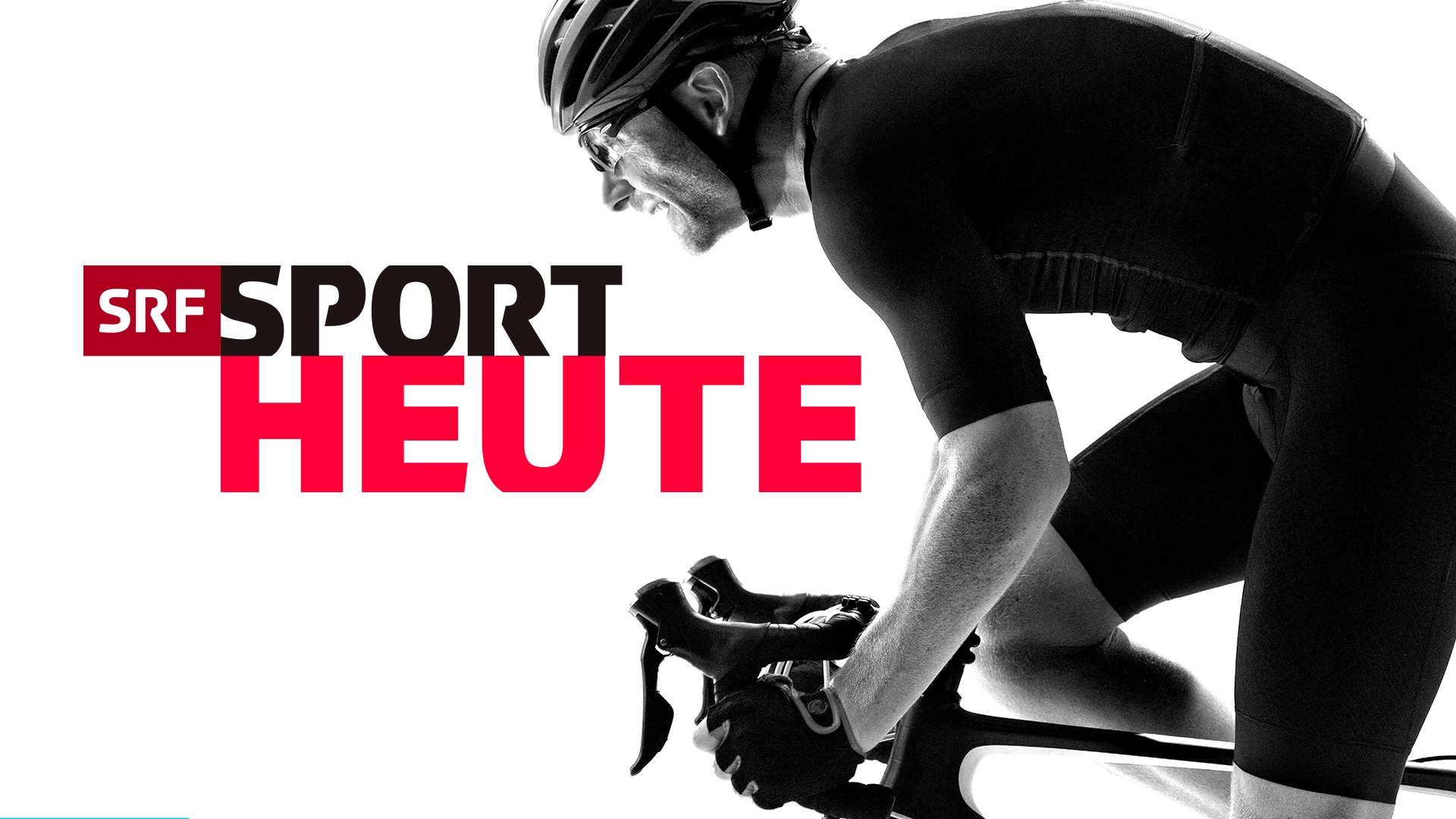
A bespoke headline font embraces the concept of ‘Feeling Closer’, taking the SRF brand font and adapting it to become a cropped typeface that seamlessly stacks. This stacking effect lends itself to impactful headlines and a system of logos that compliments the primary SRF Sport logo.
CLOSER TO EVERY SERVE, EVERY SAVE, EVERY SPORT
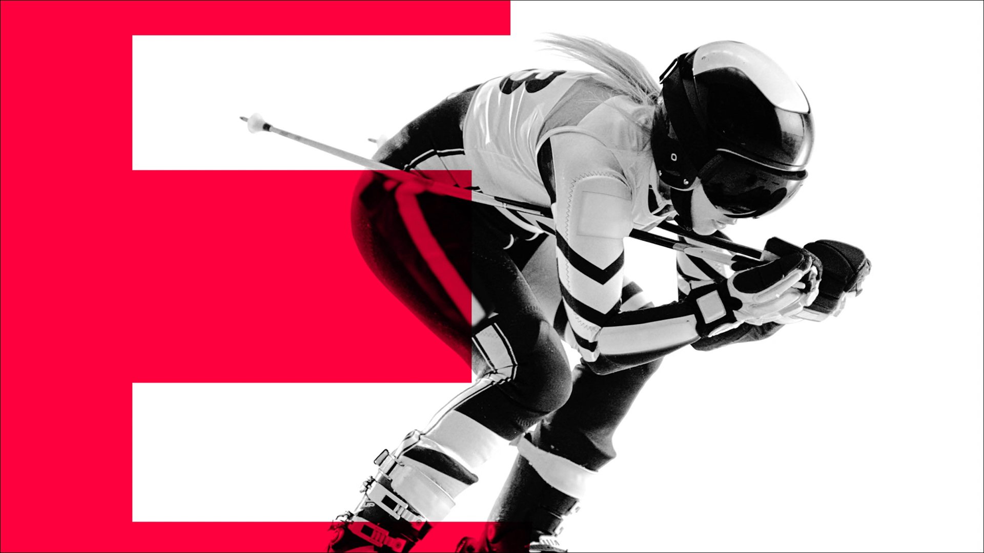
The lens is a device that takes us closer to every moment of action. Using the horizontal and vertical lines of the Swiss flag, visuals are enhanced through the graphic lens, getting closer to every flake of snow, every blade of grass and every bead of sweat.
The lens device operates alongside the other graphic elements in the show title sequences. These short openers build a gritty anticipation ahead of each live event, embracing the strong black and white visuals to fun effect to intensify the action.
Aktualität shows focus on sports news and reports, made all the more stylised by super slo-mo visuals shot against a clean studio backdrop. These visuals then combine with the refractive nature of the lens and bold use of cropped letterforms, providing a more editorial feel to the programming.
TENS OF SPORTS, HUNDREDS OF VISUALS
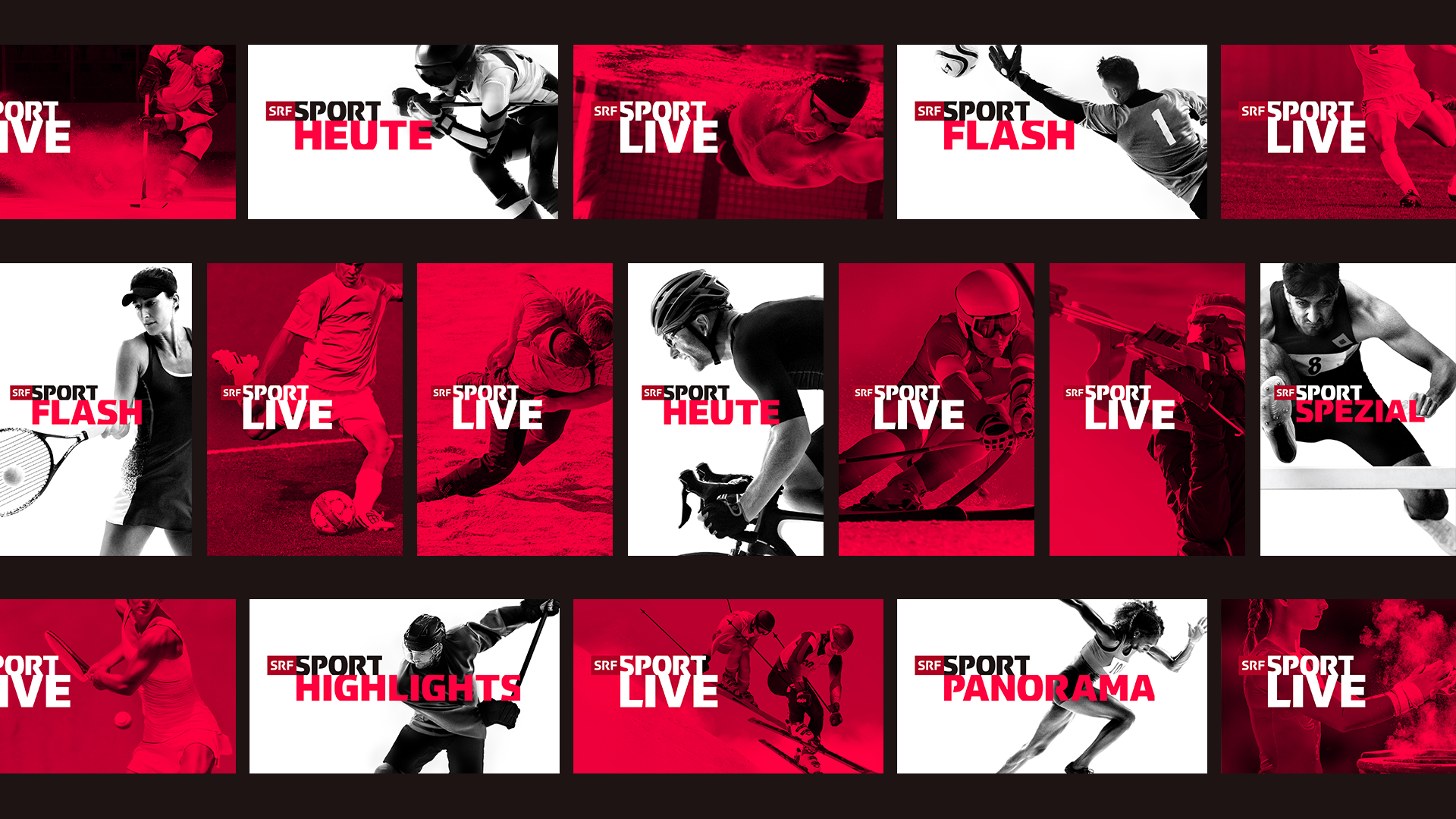
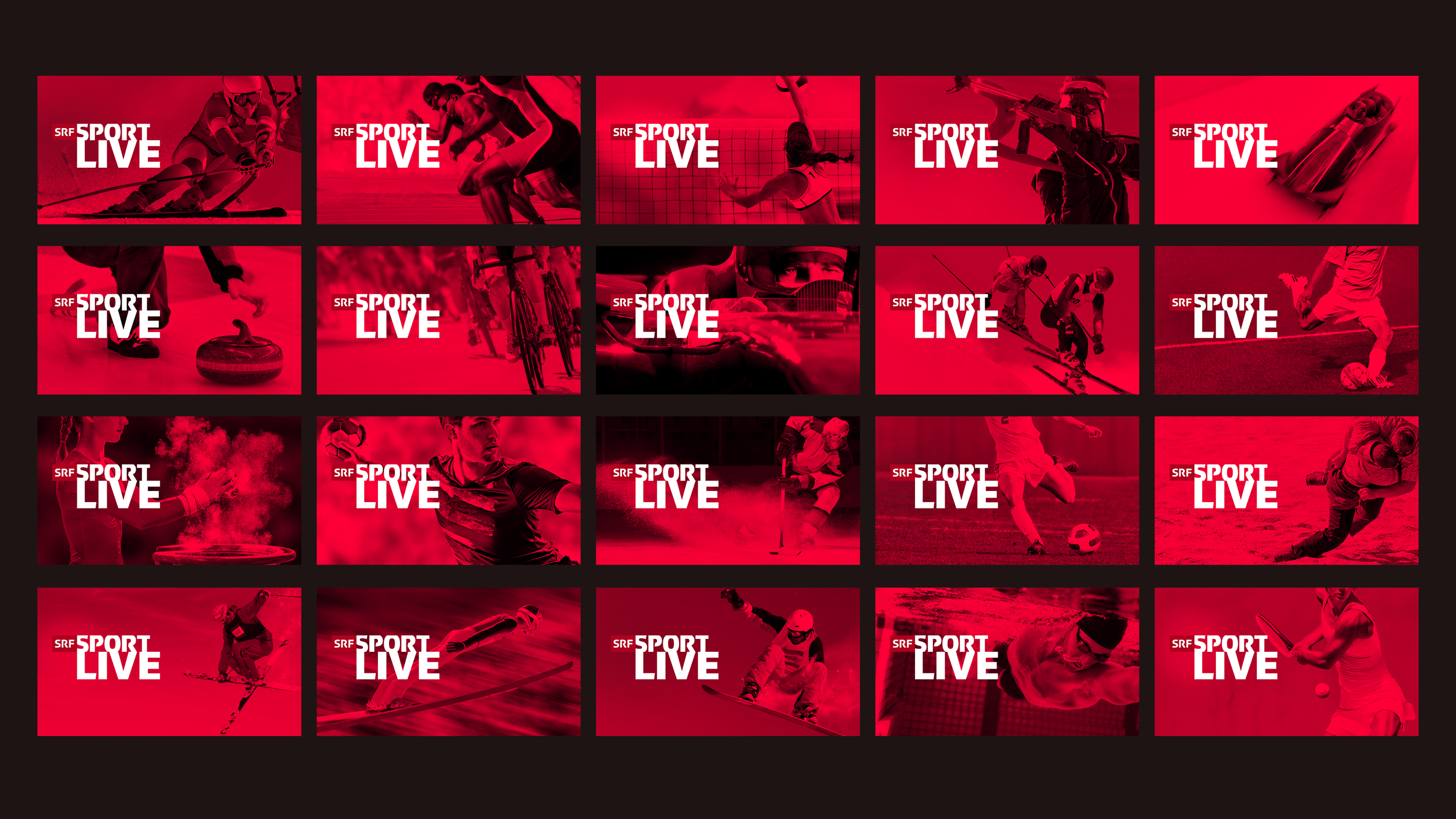
To represent the huge range of sport broadcast by SRF, a versatile set of key visuals covers every conceivable sporting discipline including a unique form of Swiss wrestling called Schwingen. These artworks adapt to a variety of different formats across print items, digital thumbnails, studio backdrops and collateral materials.
AN ON-AIR SYSTEM BUILT TO SCALE UP
The on-air mechanics continue to bring audiences closer with a focus on scaling elements on-screen, while bold headlines and titles enlarge beyond their boundaries to provide the cropping effect in motion. The graphic backdrops to the package use super-sized crops of the word sport to create high-contrast patterns and shapes.
A NEW LOOK STUDIO
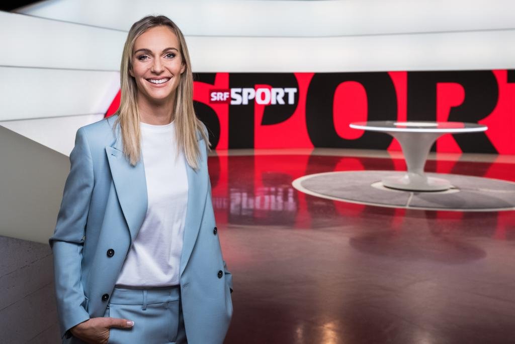
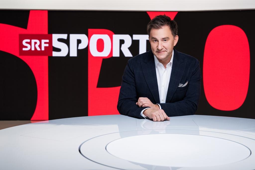
The brand look threads through every SRF Sport environment with the bold graphic crops wrapping the studio environments and refining the broadcast look in all programmes.
SOCIAL THAT BRINGS FANS CLOSER
Across social and digital platforms, the brand imprints cut through the noise and instantly inject the distinct palette of SRF Sport, taking ownership of the sporting moments with attention-grabbing content.
CREDITS
Collaboration with Superunion
Executive Creative Director: Stuart Radford
Creative Director: Graeme Haig
Designers: Gareth Tansey, Dorian Thomas, James Pykett, Adam Wouldes, Dan Cramer
Editor: Robin Gray
Post: Ecstasy of Gold
Production: Sophia Pendar-Hughes
